Andrea Morrison
For Andrea Morrison Coaching, I crafted a vibrant rebrand that captures Andrea’s unapologetic energy and empowering ethos. Drawing inspiration from 1970s design — think bold typography, playful curves, and a fearless sense of colour — the new visual identity is confident, warm, and unmistakably her. The fresh palette of rich teal and electric hot pink injects personality and power, creating a striking contrast that speaks to transformation and authenticity. This isn't a quiet rebrand — it’s loud, proud, and built to stand out.


-
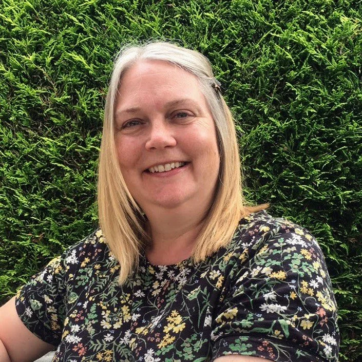
![]()
Andrea Morrison, Life coach
“What can I say? Annina is amazing! I worked with Annina to completely overhaul my branding and her work blew me away. Her designs are fresh, creative, impactful, everything you want in a designer but most of all she really gets the heart of your brand, and creates imagery and design that is everything that you want to say. She now does all of my creative art work and people just know that it's my brand, it's incredible. I highly recommend her, every business should work with her, they won't regret it!”
-
![]()
Gina Stringer, Stand Tall PR
"Annina created all the branding for my new business, she understood the brief perfectly and exceeded all my expectations, bringing my business to life with a brand I am beyond proud of. Not only is she extremely talented, she's a pleasure to work with too and very clear with her communication. I'd happily recommend her to anyone!"
-
![]()
Dot Appleby, Field 216
“Annina is a branding wizard. Not only does she put you completely at ease, but she brings out the personality and individuality of your business in the designs. She was tolerant of my ‘tweaks’ and I’m so happy with end product.”
-
![]()
Paul Craddy, Remap Consulting
“I'd highly recommend working with Annina. She is incredibly talented, quick to respond and very creative. She helped developed the branding for my company, which we keep being complemented on by our clients. A real pleasure to work with and who delivers excellent results.”
-
![]()
Emily Pickard, York Mumbler
“Annina is an absolute joy to work with. She is one of these people who just says yes, gets stuck in and delivers great results, so refreshing! She's very talented and although has her own unique style, can adapt and work to any brief. She clearly takes great pride in her work and gets to know what you want to achieve. if you're looking for a designer for your business then this is your lady!”
-
![]()
Laura McDonagh, Writer
“Annina is everything you need in a graphic designer: creative, intuitive, patient, responsive and highly professional. I've had so many compliments on my new branding!”
-
![]()
Mary Mandis, Yorkshire Rose Candles
“I had worked with a couple of graphic designers before but they never quite understood what I wanted. But Annina, got it from the beginning. Her branding knowledge is first class. Working with Annina, was fab she is very professional and she kept me informed on timescales all the time, her communication was great.”
-
![]()
Caitlin Hazell, Caitlin Hazell PR
“I worked with Annina on branding for a new business. She interpreted the brief perfectly, in fact better than I could have hoped for. I have received lots of lovely feedback from clients. Annina is incredible talented and a pleasure to work with!”
-
![]()
Helen Booth, Masque Photography
“Annina completely hit the nail on the head with my re-branding! She is a complete professional from the ideas conception right through to the final design. Collaborating with me to inspire the most perfect design for my business. I can not recommend her highly enough.”
-
![]()
Alice Lodge, Photographer
“Annina did an absolutely fantastic job of designing my logo and working out some colours and shapes to include in my brand. The whole process was so much fun as it started with some very vague ideas of mine which then where brought to live by Annina. Her ideas where really inspiring and gave me a good idea of where I wanted to go with it. The final product is just perfect. It’s really me and unusual and beautiful.”